How Apple’s Software Design Went from Lickable to Legendary

It was the summer of 2020. Apple, mid-pandemic, mid-keynote, rolled out a new version of macOS. Nothing loud. Nothing flashy. But sharp-eyed designers noticed something: the icons looked different.
Rounded. Glossed. Familiar in shape but unfamiliar in depth. A merging of macOS and iOS. Control Center, widgets, translucency, all lifted from mobile. And those icons? Abstract glyphs floating over gentle gradients and shadows. Subtle, but telling. They whispered something bigger.
Neomorphism.
It was the soft return of texture. A bridge between the skeuomorphic past and flat present. A design gesture that nodded in two directions at once, forward and backward.
The Return of Jobs. The Rise of Forstall.
To understand how we got here, you have to rewind to 1996.
Apple was dying. Steve Jobs came back to a company with 90 days of cash left. His first move? Kill the noise. Cut the dead weight. Simplify the product line.
But survival needed more than hardware. It needed interface.
Jobs turned to a young software engineer from NeXT named Scott Forstall. The story of their first meeting has become folklore. Jobs stopped him mid-interview and said, “I don’t care what anyone else says today, I’m giving you an offer. But pretend to care about their questions.” Then he added, “And I know you’ll accept.”
He wasn’t wrong.
Forstall joined, rose quickly, and became one of Jobs’ closest allies. Ambitious. Brilliant. Detail-obsessed. He kept a jeweler’s loupe on his desk to inspect icons pixel by pixel. That’s not metaphor. That’s literal.
When Jobs needed a new look for the Mac, he gave Forstall the keys. What came next was Aqua.
Aqua: The Interface You Could Lick

macOS X launched in 2001 with Aqua as its new interface. It looked nothing like the grayscale world of Windows. Aqua had shimmer. Gloss. Buttons like beads of water. Windows with shadows that floated off the screen.
Jobs loved it. “When you see it, you’ll want to lick it.”
Aqua set a tone. Apple wasn’t going to be boring. Over the next several years, they layered in textures, brushed metal in 10.3, reflective dock surfaces in 10.5, linen fabric in 10.7. Aqua was alive, emotional, almost cinematic.
It was Pixar logic, repurposed for software.
iPhone: Skeuomorphism in Your Pocket
When Apple started building the iPhone, Jobs handed the UI challenge to Forstall. And Aqua’s spirit came with him.
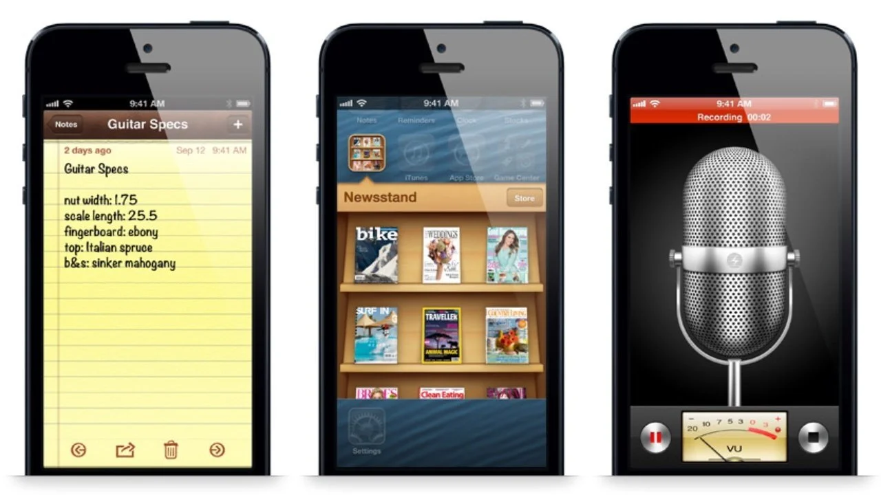
The Notes app looked like a legal pad. The Contacts app looked like a spiral-bound notebook. When you opened Calendar, you saw leather stitching. When you flipped pages, it felt like a book.
This wasn’t kitsch. It was strategy.
Forstall believed in visual metaphors. Design something new, but make it look like something old. That way, people know what to do without needing instruction. It worked because people still used physical notepads, planners, and address books. The iPhone mimicked what it meant to replace.
He was so committed to realism that he refused to make the Contacts app full-height in portrait mode because no one holds a book that way. That's how deep the metaphor ran.
The Definition: What Is Skeuomorphism?
Skeuomorphism is when digital design references the physical world. A notepad app looks like a legal pad. A trash icon looks like a trash can. It helps users understand new tools through old ones.
It’s also why the Save icon is still a floppy disk. Even if most users today have never touched one. Back when personal computers took off, saving meant writing to a floppy. The icon stuck. Long after the hardware disappeared, the symbol remained. It’s a skeuomorph, an old metaphor with no present context.
That’s the paradox. The more we evolve past analog, the more those metaphors fade. And when the object no longer exists, the metaphor stops working. For a kid in 2024, a floppy disk is just an abstract shape.
Time Machine and the Limits of Literalism
Some metaphors landed beautifully. Like Time Machine in macOS 10.5. You back up your files by scrolling through the stars, traveling through a galaxy of your own data. A backup system disguised as time travel.
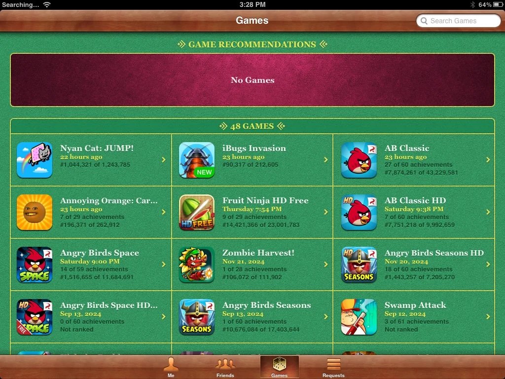
Others missed completely. Remember Game Center in iOS 6? Apple gave it green felt, wood trim, chalk lines, like a casino table. But it wasn’t a card game. It was a scoreboard for digital achievements. The design didn’t explain the function. It confused it.
When metaphor fails, it turns elegance into noise.
The Jony Ive Rift
Inside Apple, a quiet war had been brewing. Forstall’s metaphors were clashing with Jony Ive’s minimalism. Ive, the industrial designer behind Apple’s hardware, saw skeuomorphism as clutter. Faux leather and stitched borders made him wince.
Jobs had mediated the tension. He liked the friction. Believed it made the products better.
But after Jobs passed in 2011, Forstall lost his biggest ally. His relationships soured. Executives avoided one-on-ones. The company got tired of the excess. And tired of him.
In 2012, after the failure of Apple Maps and internal tension over design direction, Apple asked Forstall to leave. No keynote goodbye. No sendoff tweet. Just silence.
And with him, skeuomorphism left too.
The Flat Era and What Came Next

Jony Ive took the reins of software design. iOS 7 dropped in 2013 and erased nearly every metaphor. No textures. No leather. No drop shadows. The world became flat, neon, and white.
But over time, that too began to soften. Depth returned. Shadow returned. Icons gained dimension again. Not skeuomorphism, but not quite flat either. Something new. Something in between.
Designers called it neomorphism. A hybrid. A quiet nod to Apple’s past without dragging the whole aesthetic back.
Where We Are Now
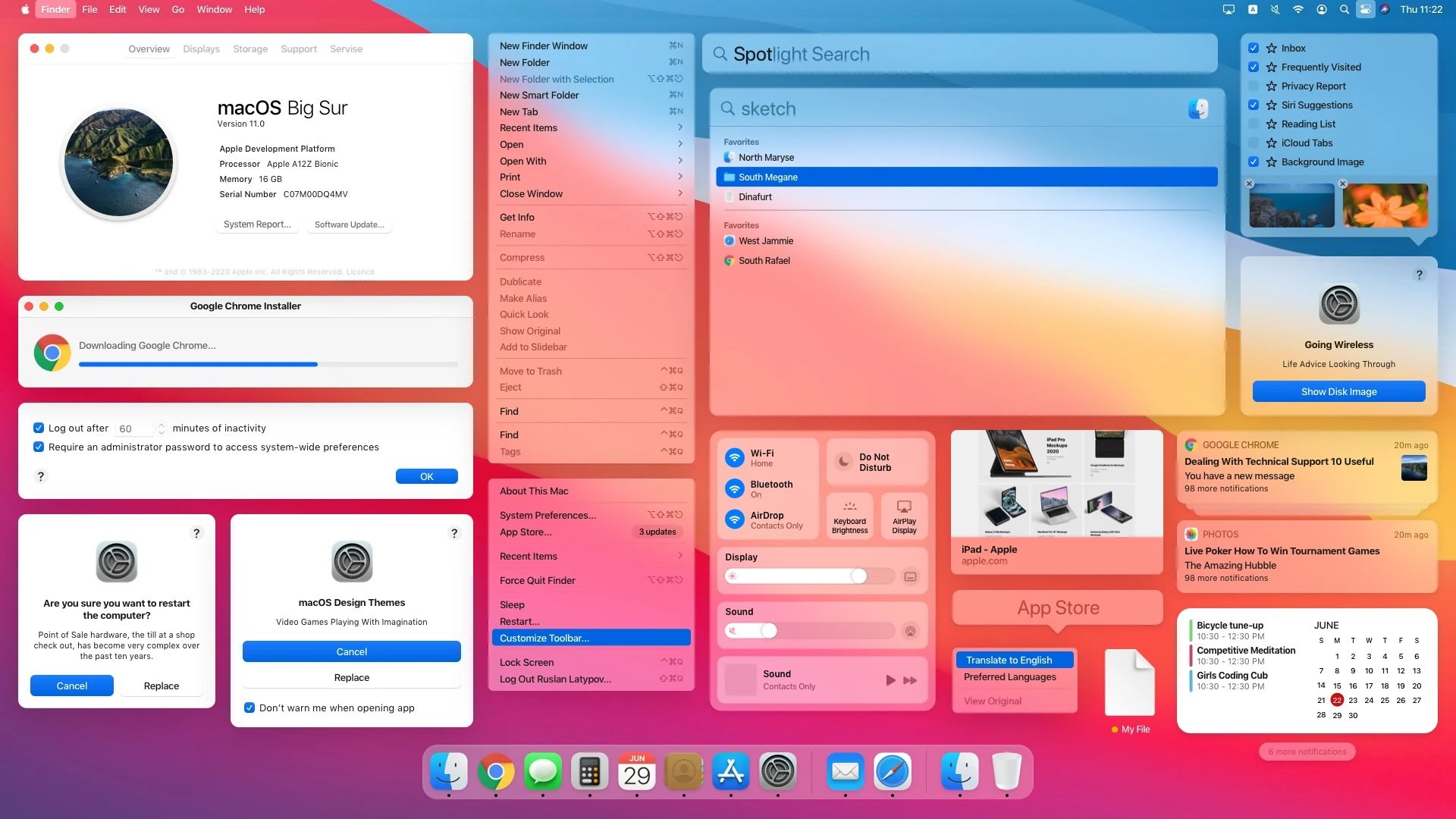
In 2020, macOS Big Sur debuted. And the icons looked familiar. Not old-school. Not fully flat. But dimensional. Rounded. Playful.
Apple had found its middle ground.
They no longer needed to convince users what apps were. But they hadn’t forgotten what made people fall in love with them in the first place.
Forstall is long gone. But the ethos lingers.
Aqua. Gloss. That jeweler’s loupe. The idea that software should feel like something you want to touch. That design should seduce. That metaphors matter.
This was part one. Next up is part two: iOS 7 to Big Sur and the rise of minimalism.
But remember this, before the flat design revolution, Apple made software that shimmered.
And you wanted to lick it.