How Apple’s Flat Design Era Ended With Big Sur’s Neomorphism

When we last left Apple, Jony Ive had taken a sledgehammer to skeuomorphism. Leather, felt, woodgrain, all of it gone in an instant. iOS 7 redrew the rules with thin lines, bright colors, and enough white space to make critics wonder if Apple had forgotten how to decorate.
For years, that flat look stuck. It spread from the iPhone to the iPad to the Mac, draining the gloss out of Aqua and sanding down the texture that once defined Apple’s software. By the late 2010s, flatness wasn’t just Apple’s aesthetic. It was the industry’s default.
And then, quietly, in 2020, the edges started to soften. At WWDC that summer, macOS Big Sur arrived with icons that looked different. Familiar in shape, but not in feel. They weren’t leather-bound skeuomorphs, but they weren’t sterile glyphs either. They had shadows, highlights, and a sense of depth that felt like a throwback and a leap forward at the same time.
Neomorphism. Apple’s first visible sign that the flat era was ending.
Exit Forstall, Enter Ive

To understand Big Sur, you have to rewind to 2012.
That was the year Scott Forstall, the guy who gave us six versions of iOS filled with stitched leather and green felt, suddenly left Apple. Depending on who you ask, he got pushed out because of Apple Maps, or because he clashed with Tim Cook, or because everyone else just got tired of arguing with him.
When he left, Apple did something radical. They handed control of software design to Jony Ive.
This was not a small thing. Ive had been the industrial designer, the guy who gave us the iMac, the iPod, the iPhone. He lived in glass and aluminum. He made hardware sing. He did not do software.
And yet, suddenly, he was in charge of both.
You probably know Ive’s voice even if you don’t know his face. He’s the guy narrating all those Apple videos in a British accent so sharp that Steve Jobs once made fun of him for the way he pronounced “aluminium.”
But Ive’s story goes back further. He joined Apple in 1992 after a stint in London design consultancies. When Jobs came back in 1996, his first instinct was to get rid of Apple’s internal design team and outsource the whole thing. Then he toured Ive’s lab. He saw what Ive and his crew were building. And he changed his mind immediately.
Jobs and Ive became inseparable. They ate lunch together every day. Apple even built a secret corridor connecting Jobs’ office to Ive’s studio so Jobs could wander in unannounced. Imagine being so close to your boss that the company literally builds a tunnel so he can bug you whenever he wants.
The Ghost of Dieter Rams

Ive didn’t come out of nowhere. He was obsessed with Dieter Rams, the German designer who shaped Braun’s look in the mid-20th century. Rams worked in the Bauhaus tradition, stripping design down until only function remained.
Form follows function. Less is more. These weren’t catchy slogans. They were gospel.
Rams designed radios, calculators, record players. The SK4 record player was nicknamed “Snow White’s Coffin” because it looked like something you’d put a fairytale princess in. His ET66 calculator is so iconic that when Apple designed its Calculator app, it basically looked like Braun’s calculator with an iOS skin.
Rams believed in being honest with materials. Metal should look like metal. Plastic should look like plastic.
That philosophy bled directly into Apple.
Unapologetically Plastic

In 2013, Apple released the iPhone 5C. It was colorful. It was cheaper. And Jony Ive described it as “beautifully, unapologetically plastic.”
That phrase became a meme. People laughed. But it made sense to him.
The 5C didn’t pretend to be anything other than what it was. It was plastic, and it felt like plastic, and it looked like plastic. Compare that to Samsung, who at the time sold phones with plastic backs pretending to be leather and plastic edges pretending to be brushed metal. Samsung was apologetically plastic. Apple was not.
This was the core of Ive’s philosophy. Materials should not lie.
The Flat Reset of iOS 7

So what happens when a guy obsessed with material honesty takes over software design?
You get iOS 7.
In 2013, Apple nuked skeuomorphism from orbit. Gone were the fake textures. Gone were the shadows. Gone was Game Center’s green felt, which had become the punchline of jokes across the internet.
Instead, you got a blank canvas. White screens. Bright colors. Helvetica Neue Ultra Thin, a font so delicate it looked like it might blow away in the wind.
Critics called it sterile. Others called it bold. Either way, it was a complete reset.
Ive explained it simply: skeuomorphism made sense in 2007, when you had to convince people that tapping a glass screen could replace real buttons. But by 2013, people didn’t need training wheels. They were ready for something honest.
The Notes app lost its yellow legal pad. iBooks lost its woodgrain bookshelf. Contacts lost its stitched leather notebook. Photos went abstract. Calculator still nodded at Rams’ ET66, but without the playful skeuomorphs.
Once you stripped away the metaphors, apps could be anything. They weren’t chained to the real world anymore.
Yosemite: The Mac Gets Pulled Along

In 2014, Yosemite brought the flat design to the Mac.
This was the first big redraw of Mac icons since 2001. Glossy buttons disappeared. Heavy textures were gone. But unlike iOS, the Mac resisted total flatness. Finder still smiled. Mail still looked like an envelope. Preview still had a magnifying glass.
They weren’t realistic. They were caricatures of their old selves, like cartoon versions of photorealistic icons.
That look persisted for six years. Through El Capitan, Sierra, High Sierra, Mojave, and Catalina. Six years of compromise.
Big Sur: Shadows Return

Suddenly, the icons were not just flat anymore. They had depth. They had dimension.
Look at Messages. On iOS, it was just a flat bubble. On Big Sur, the bubble had highlights, shadows, reflections. The background color bounced off the surface. The bubble cast a shadow onto the background. These are the artifacts of light in reality.
Apple had not returned to skeuomorphism. But it also had not stayed flat. Neomorphism was the middle ground.
And for the first time, the Mac and iOS felt like they belonged to the same visual family. Continuity between Apple’s two most important platforms.
AR and the Future
This was not just an aesthetic refresh. It was strategic.
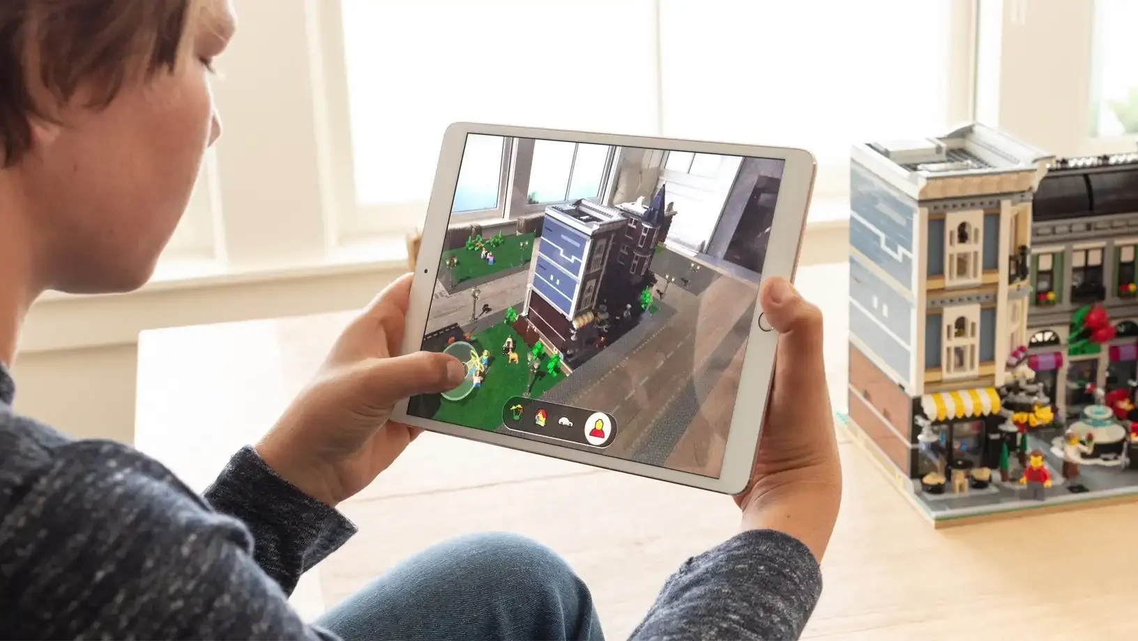
By 2020, Apple was deep into AR. ARKit was years old. Headset rumors were everywhere.
Flat UI makes sense on a screen. In augmented reality, it looks wrong. Nothing in real life is perfectly lit or shadowless. Neomorphic icons, with their shading and reflections, looked like they could exist in reality. They felt anchored, like you could reach out and touch them.
Apple even started experimenting with neomorphic icons on iOS, like the App Store Connect app. Third-party developers followed suit. This was not a one-off experiment. This was the beginning of something.
I’ves Long Goodbye

Here is the twist. Jony Ive wasn’t even at Apple when Big Sur shipped.
By 2019, he had left.
His rise at Apple had been steady but relentless. He clashed with Jon Rubinstein. Rubinstein left. He clashed with Scott Forstall. Forstall left. Bit by bit, Ive gained more power until he was Chief Design Officer, a role where nobody could tell him what to do.
But by then, he was drifting. He cared more about one-off luxury projects, about designing high-end cameras and cars. He pushed for the $10,000 gold Apple Watch Edition because he wanted it to be fashion. He turned his focus to architecture, pouring himself into Apple Park, the literal spaceship of a campus.
Then he walked away. Not angry. Not forced. Just done.
He started LoveFrom, a design consultancy, with Marc Newson. Apple was his first client. In a way, he had returned to his roots, back to consulting, back to the role he played before Apple hired him in 1992.
The Team He Left Behind
The team Ive built at Apple was one of the most stable in the industry. In fifteen years, only two people left, and one of them for health reasons. They were tightly knit, internationally awarded, and still in place after he left.
Apple design did not collapse after Jobs died. It did not collapse after Ive left.
Neomorphism, like flatness before it, arrived after a major departure. iOS 7 after Forstall. Big Sur after Ive.
That timing tells you something. Apple’s design language keeps moving, but it does not move alone. It moves when leadership changes.
Shadows as Signals
So where does that leave Apple now.
Flatness did not fail. It just ended. It was the right style for the right time, until the time changed.
Big Sur did not bring back skeuomorphism. It brought back shadows. And in those shadows you can see the direction Apple is pointing. Toward a future where software no longer lives only behind glass, but in the world around us.
Sometimes the future does not start with a keynote slide or a slogan. Sometimes it sneaks in as a reflection, a gradient, a faint cast of depth.
Sometimes the future starts with a shadow.