Why Apple’s Old Software Looked So Real: A Skeuomorphism Story

It was the summer of 2020.
Apple was in the middle of its annual developer conference, except this time there was no stage, no crowd, no applause. Just a stream. Mid-pandemic, mid-keynote, nothing loud, nothing flashy.
And then, buried in the presentation, something small happened. Small enough that most people missed it.
The icons looked different.
Not completely different. Still familiar in shape, still colorful. But they had depth. They had shadows. They looked like they were made out of something, like they could cast light or bounce it back at you.
Designers noticed immediately.
This wasn’t skeuomorphism coming back from the dead. And it wasn’t the flat geometry Apple had sworn by since iOS 7. It was something in between. A new style with a new name.
Neomorphism.
And to explain how Apple got there, we need to rewind. All the way back to the late 1990s, when the company was weeks from running out of cash, Steve Jobs was walking back in the door, and a young engineer named Scott Forstall was about to design an interface that Jobs would describe, with a straight face, as the kind of thing you’d want to lick.
The Return of Jobs. The Rise of Forstall.

In 1996, Apple was collapsing. The company had about ninety days of cash left in the bank. The product lineup was bloated. The machines were uninspired. Apple was becoming irrelevant.
Steve Jobs returned, armed with the technology he had built at NeXT. The plan was simple: take NeXT’s operating system and transform it into the next generation of Mac OS.
But Jobs knew software wasn’t just about code. It needed an interface. Something bold. Something alive.
Enter Scott Forstall.
Forstall had followed Jobs from NeXT, where he had worked since 1992. Their first meeting became folklore. Jobs stopped him mid-interview and said, “I don’t care what anyone else asks you today, I’m giving you an offer. Pretend to care about their questions. And I know you’ll accept.”
He was right.
Forstall was ambitious, obsessive, and brilliant. He kept a jeweler’s loupe on his desk so he could examine icons pixel by pixel. That wasn’t a metaphor. That was how seriously he took design.
So when Jobs wanted a new look for the Mac, he gave Forstall the keys.
Aqua: The Interface You Could Lick

In 2001, Apple launched Mac OS X with a brand-new interface called Aqua.
It looked nothing like the grayscale world of Windows. Aqua was glossy, translucent, playful. Buttons shimmered like drops of water. Windows floated with shadows. Icons looked like miniature real-world objects, rendered with light, texture, and perspective so convincing they felt like they existed in three dimensions.
Jobs showed it off and said: “When you see it, you’ll want to lick it.”
Aqua was indulgent. Cinematic. It was Pixar logic applied to software. And that was no coincidence. Jobs had been running Pixar in parallel, pushing computer-generated films like Toy Story 2. The same techniques that made toys come alive on screen showed up in Aqua’s buttons, icons, and shadows.
Over the years, Apple layered on more. Brushed metal toolbars in 10.3. A reflective dock in 10.5. Linen textures in 10.7. Aqua wasn’t subtle. It wasn’t quiet. It was alive.
iPhone: Skeuomorphism in Your Pocket
When Apple built the iPhone, Jobs again put Forstall in charge of the interface. Aqua came along for the ride.
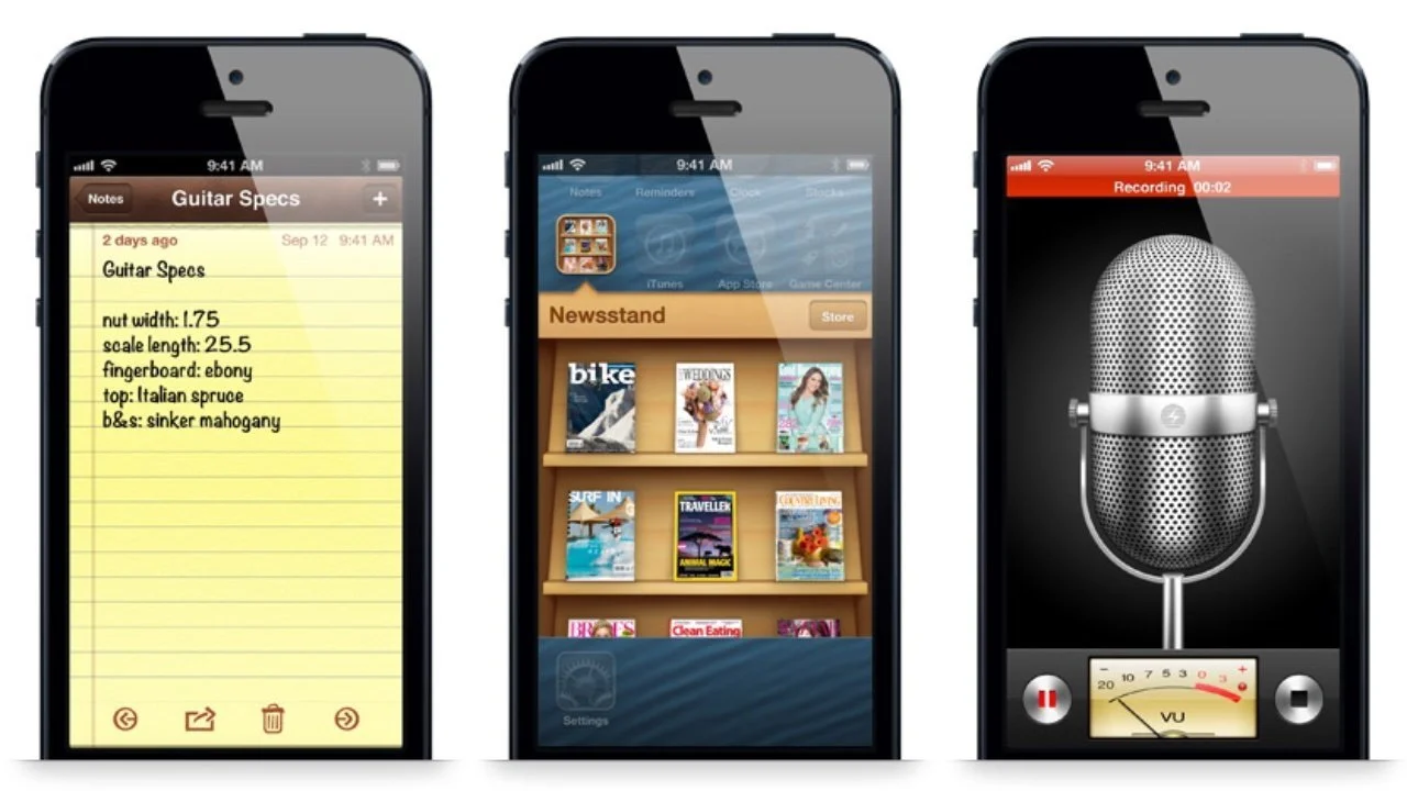
Notes looked like a yellow legal pad. Contacts looked like a spiral notebook. Calendar had leather stitching. iBooks turned pages like a physical book.
This wasn’t nostalgia. It was strategy.
Forstall believed in skeuomorphism. New technology could be scary. So you design it to look like something old. Something familiar. That way, users don’t need a manual. They just know.
He was so committed to realism that he refused to make Contacts expand to full height in portrait mode. Why? Because no one holds a book that way. That was the level of obsession.
And it worked. By 2011, the iPhone and iPad made up nearly 70 percent of Apple’s revenue. Whatever people thought of skeuomorphism, it was selling devices.
What Is Skeuomorphism?

Skeuomorphism means making digital design reference the physical world. A trash icon that looks like a trash can. A notepad app that looks like paper. A Save button that looks like a floppy disk.
That floppy disk is the strangest skeuomorph of all. Most people today have never used one. But in the 1980s and 90s, saving meant writing to a floppy. The icon stuck. Long after the hardware disappeared, the metaphor survived.
That’s skeuomorphism’s paradox. It works until the physical object disappears. Then the metaphor becomes confusing.
And there’s another problem. What do you do when you’re designing something that doesn’t exist in real life? What does a web browser look like? What does instant messaging look like? You end up inventing metaphors, even when they don’t make sense.
Sometimes Apple nailed it. In 2007, Time Machine turned backups into time travel, with files flying backward into a galaxy of stars. Backing up your computer suddenly felt like science fiction.
Other times, it was a disaster. Game Center in iOS 6 looked like a casino table, with green felt and wood trim. But it wasn’t a card game. It was just a scoreboard for achievements. The metaphor didn’t match the function. It made no sense.
When skeuomorphism worked, it felt magical. When it didn’t, it felt like parody.
Ive vs. Forstall
Inside Apple, a quiet war was brewing.
Forstall loved skeuomorphism. He believed metaphors made software approachable.
Jony Ive, the industrial designer behind Apple’s hardware, hated it. He believed in honesty of materials. Aluminum should look like aluminum. Plastic should look like plastic. Leather stitching on a screen? To him, that was clutter. A lie.
Jobs kept the peace. He liked tension. He thought the friction made the products better.
But when Jobs died in 2011, Forstall lost his shield. His abrasive personality, which Jobs tolerated, alienated almost everyone else. Executives refused to meet with him one-on-one.
Jobs liked the conflict. Without Jobs, it just became conflict.
In 2012, after the Apple Maps fiasco, Forstall was asked to leave. No keynote farewell. No thank-you letter. Just gone.
And skeuomorphism left with him.
The Legacy of Lickable Software

He left behind a decade of interfaces that shimmered and sparkled, apps that mimicked real-world objects so convincingly that new technology felt instantly familiar. Skeuomorphism helped Apple climb out of bankruptcy. It helped turn the iPhone into the product that redefined the company.
History hasn’t been kind to skeuomorphism. Designers mocked it as dated, kitschy, over-decorated. But even now, Apple sneaks in little nods. A shadow here. A reflection there. Tiny echoes of a time when your computer looked like a desk, a notebook, a bookshelf, a casino table, and a leather planner all at once.
Before flat design. Before minimalism. Before neomorphism. Apple made software so glossy, so indulgent, that Steve Jobs told the world you’d want to lick it.
And he meant it.
What came next looked nothing like this. Because when skeuomorphism left with Scott Forstall, Jony Ive flattened everything in sight. For a while, it felt permanent. But design at Apple never sits still for long. Flat was never going to be the final word.