
The Wii Wasn’t Supposed to Win, But It Did Anyway
The Nintendo Wii is not a normal video game console.
When it came out in 2006, it looked like… nothing. A little white rectangle you could mistake for a router. A controller that looked like your TV remote, not the weapon of choice in Halo or Grand Theft Auto. And it wasn’t even that powerful. By the numbers, it was dramatically less advanced than the PlayStation 3 or the Xbox 360.
And yet, it outsold both of them. It outsold all of them. Over 100 million Wiis ended up in homes around the world. Retirement communities. Hospitals. Living rooms where no game console had ever been allowed before.
How does something that looks like it’s trying not to be noticed completely change the game industry? The answer is in its design. But design doesn’t just mean what it looked like. It means how it felt, how it sounded, how you experienced it from the moment you opened the box. And the Wii is one of those rare products where everything, hardware, software, sound, user experience, lined up behind a single idea: video games should be for everyone.
The Console That Wanted to Disappear
Nintendo had a reputation for making toys. The NES looked like a toy VCR. The Nintendo 64 looked like a spaceship. The GameCube… was literally a cube with a handle. They leaned into it.
But the Wii? Satoru Iwata, Nintendo’s president, told his designers to make something that would disappear. He literally stacked three DVD cases on a table and said: make the console this big. That’s the whole brief.
And somehow, they did it. The Wii is smaller than your average hardcover book. It’s glossy white, with a little curve on the front and a glowing blue slot where the disc goes in. It sits upright on a stand, tilted like it’s trying to look confident, but not too confident. The point was simple: it had to fit anywhere. No family was going to rearrange their entire living room to make space for a hulking black monolith like the PlayStation 3. The Wii had to slide right in, like it had always belonged.
Nintendo literally tested it by putting prototypes next to TVs and asking, does this look natural? Too toy-like? Too much like AV equipment? They wanted it right in the middle. Friendly enough to be fun, refined enough to sit next to your DVD player without embarrassment.
The Remote That Changed Everything
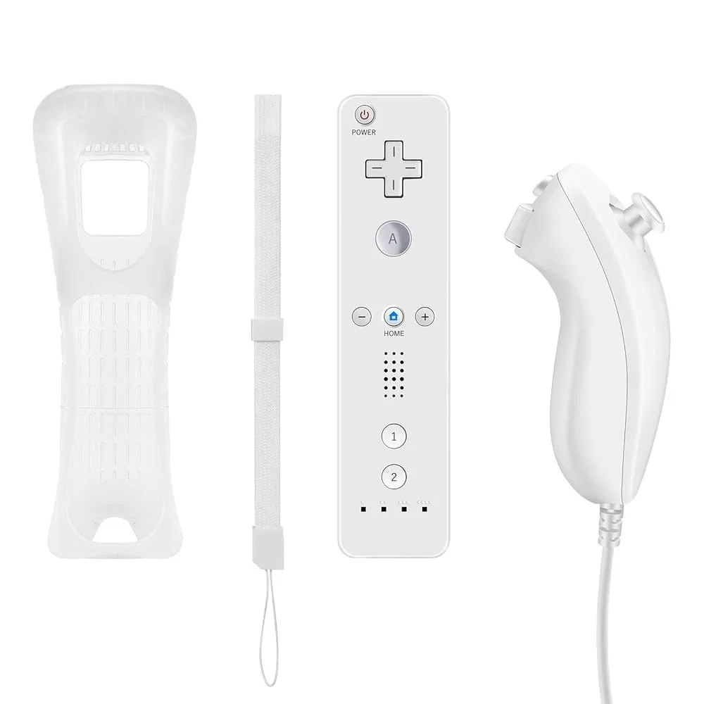
The Wii Remote looks like the kind of thing you lose in your couch cushions. Which, actually, is kind of the point.
Nintendo’s designers wanted to break away from the idea that controllers had to be intimidating two-handed gadgets covered in buttons. What’s the one object everyone in a living room already knows how to use? A remote.
The Wii Remote was their answer. One hand. A big A button on the front, a trigger on the back. A D-pad, a couple of extras, but nothing scary. And most importantly: motion sensors and infrared pointing. For the first time, you could literally point at the screen and swing it like a racket, a sword, or a steering wheel.
Of course, this didn’t happen overnight. Early prototypes looked more like traditional gamepads. They even built a weird two-handed paddle they called the “Gunbai.” But Shigeru Miyamoto, the man who created Mario and Zelda and had studied industrial design in school, looked at that and said: no. We start with the rod. We start with the simplest possible form.
From there, the Remote became a kind of Swiss Army knife. Need more complexity? Plug in the Nunchuk, with an analog stick. Want to play classic games? Plug in the Classic Controller. But if all you wanted to do was swing a virtual tennis racket, the Remote was enough.
The result was genius. Suddenly, grandma could play. Little kids could play. People who had never touched a controller could play. It turned out that making something simpler didn’t limit it. It expanded it.
The TV That Played Back
Turning on the Wii felt less like booting a computer and more like flipping on the TV. That was on purpose.
Nintendo’s software team asked: how do we make the menu something people actually want to use? Their answer was channels. A grid of big, simple icons you could point at with the Wii Remote. News, Weather, Photos, the Disc Channel for games, the Mii Channel. Each one looked like a TV channel, complete with transitions that flashed like static when you switched.
It sounds basic now, but in 2006 this was radical. Game consoles didn’t have welcoming, everyday interfaces. They had barebones menus hidden behind startup screens. The Wii brought its system software front and center. It said: you’ll use this every day, not just when you’re playing games.
And it worked. Families turned the Wii on to check the forecast. Kids voted on polls in the Everybody Votes Channel. People created Miis that looked like themselves and their friends. The menu became part of the experience, not just a means to an end.
The Sounds That Stuck in Your Head
There’s a reason Wii music lives rent-free in your brain.
Kazumi Totaka, Nintendo’s legendary composer, was responsible for much of the system’s sound design. He made the Wii Menu theme, a looping, jazzy little number that somehow never gets annoying even after hours. He made the Mii Channel’s calypso tune, which became an internet meme years later. And he made the Wii Shop Channel’s playful melody, turning digital purchases into a mini-vacation.
Every sound had a purpose. Hover over an icon? Click. Select it? Whoosh. Error? A gentle bonk that says “oops” instead of “you screwed up.” Even the Wii’s startup chime was a soft, mystical chord, just enough to feel magical, never enough to wake the baby.
And then there was the Wii Remote speaker. The tiny sounds coming from your hand, bowling pins crashing, a sword swipe, the crack of a baseball, added a physicality no other console had. Combined with the motion controls, it made the Wii feel alive in your hand.
It’s no exaggeration to say the Wii’s sound design defined its personality. Light, funny, unthreatening. The opposite of the bombastic orchestral scores you’d hear when turning on a PlayStation.
The First Five Minutes
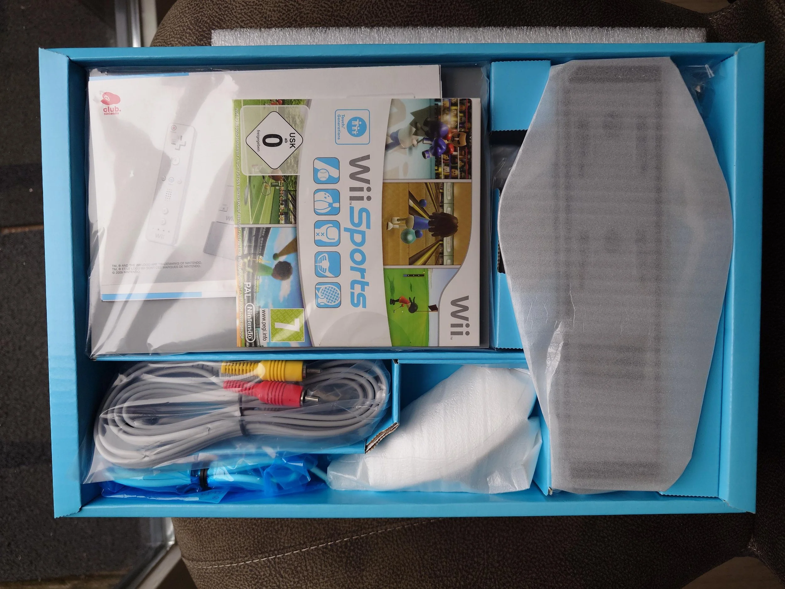
Nintendo didn’t just design the console and interface. They designed the first five minutes of owning a Wii.
Open the box: neat, organized compartments with light blue cardboard inserts. Instructions mostly pictures, not words. Plugging it in was simple. No complicated settings, no mandatory updates.
Turn it on: big channels, a glowing slot, friendly music.
Pick up Wii Sports: it’s right there in the box. Within minutes, you’re swinging a racket or rolling a bowling ball. No tutorial, no manual. The game itself was the tutorial.
And before you even played, chances are you made a Mii. That act of creating yourself, watching your cartoon double wave at you from the menu, instantly gave you ownership of the system. It wasn’t just Nintendo’s console anymore, it was yours.
A Console for Everyone

The Wii was designed for people who had never even considered themselves gamers.
Nintendo’s marketing made this clear. The “Wii would like to play” commercials showed polite visitors handing the Remote to families of all ages. Grandparents, parents, kids, friends, all laughing together in living rooms. The price point was lower, the setup was simpler, the games were approachable.
And the result was explosive. Retirement homes used Wii Bowling as social activity. Hospitals used Wii Fit for physical therapy. Families that never would have bought an Xbox or PlayStation made space for a Wii. It was no longer just a console. It was a living-room appliance, as ordinary as a TV or a DVD player.
The Aftermath
The Wii’s design choices paid off. Critics praised it. Design communities awarded it. MoMA eventually put one in its permanent collection. And it sold more than 100 million units, outselling both the Xbox 360 and PlayStation 3.
But maybe the biggest legacy was what it proved. It showed that you don’t have to chase specs to innovate. You don’t have to compete on power to win. Sometimes, the right answer is to step sideways, to rethink what the product is for and who it’s for.
Competitors scrambled to follow. Sony made the PlayStation Move, Microsoft made the Kinect. Neither captured the same magic. But the idea that games could be motion-based, physical, intuitive, that stuck. You can see it today in VR controllers, in the Nintendo Switch’s Joy-Cons, in the way smartphones normalized touch as the default input.
The Wii also left behind a cautionary tale. Its successor, the Wii U, tried to build on the Wii’s legacy with a tablet controller, but confused its message. It proved how fragile clarity is. The Wii worked because everything, hardware, UX, sound, packaging, marketing, aligned around one idea: fun for everyone. Lose that clarity, and you lose the magic.
The Wii was the friendliest console ever made. And that was by design.