The End of Flat Design: How iOS and VisionOS Brought Depth Back

For twelve years, iOS was flat. Flat icons, flat buttons, flat everything. It got so normal that we stopped noticing it was flat. It just was.
And then, suddenly, it wasn’t.
This year, Apple changed iOS. Not a little change. Not a new shade of blue or a rounder corner. A real change. Icons started glowing again. Buttons started to feel like they had weight. Windows looked like they were made out of something instead of nothing.
And here is the part that makes this interesting. This is not the first time Apple has done this.
Back in 2020, when macOS Big Sur shipped with those weird glossy icons that looked like candy trapped under glass, I said Apple was heading this way. Because if Apple was serious about augmented reality, they could not stay flat forever. Flat design works on a phone. But in the real world, it looks fake.
Three years later, in 2023, Apple Vision Pro made that prediction real. VisionOS was not flat at all. It had shadows. It had light that shifted as you moved. It looked like it belonged in a room. Which makes sense. Because reality does not do flat.
And that brings us here. iOS 2026. After twelve years of flat, Apple finally committed to something else.
Physicality
The word Apple used in the keynote was physicality.
Alan Dye, Apple’s VP of UI design, said it out loud in 2023 when VisionOS debuted. Every element, he said, was designed to have physicality.
And now that same word fits iOS. Icons have specular highlights, like tiny suns bouncing off their surfaces. Buttons are raised or sunken depending on what they need to do. Window panes look like frosted glass, catching light differently depending on where you tilt them.
All of it feels alive in a way flat design never did.
If it reminds you of something, you are not wrong. Windows Vista tried this with Aero Glass. Early versions of macOS tried it with Aqua, with drop shadows and reflections everywhere. Apple is not just inventing something new here. They are reviving something old. They are making it work again, this time in service of AR.
Movement
But it is not just Apple.
Google showed off Material 3 Expressive this year. Their pitch was that software should feel playful, energetic, creative, friendly. Which sounds like four different adjectives chosen by a committee, but the results are interesting.
Most of Google’s UI still looks flat. Title bars, window chrome, the basic structure. But the movement is different. Buttons wobble. Elements stretch and stick to each other like magnets. Haptic feedback turns clicks into tiny physical nudges.
Apple has been edging toward this for years. Think about Dynamic Island. Those fluid animations that make notifications look like liquid bubbles sliding in and out of the screen. Or Apple Intelligence’s new Siri animation, a swirl that seems to ripple off the edges of the phone.
Now those kinds of flourishes are everywhere in iOS. The animations are not extra anymore. They are the design language. They are what makes the whole system feel like it has weight.
Where Is Ive

Which raises a familiar question. Where is Jony Ive in all of this?
Back in the 2000s, he was the voice of Apple design. First the hardware, then the software after Scott Forstall left in 2012. And then in 2019, he left Apple entirely to start his own firm, LoveFrom.
Since then, his projects have been all over the place.
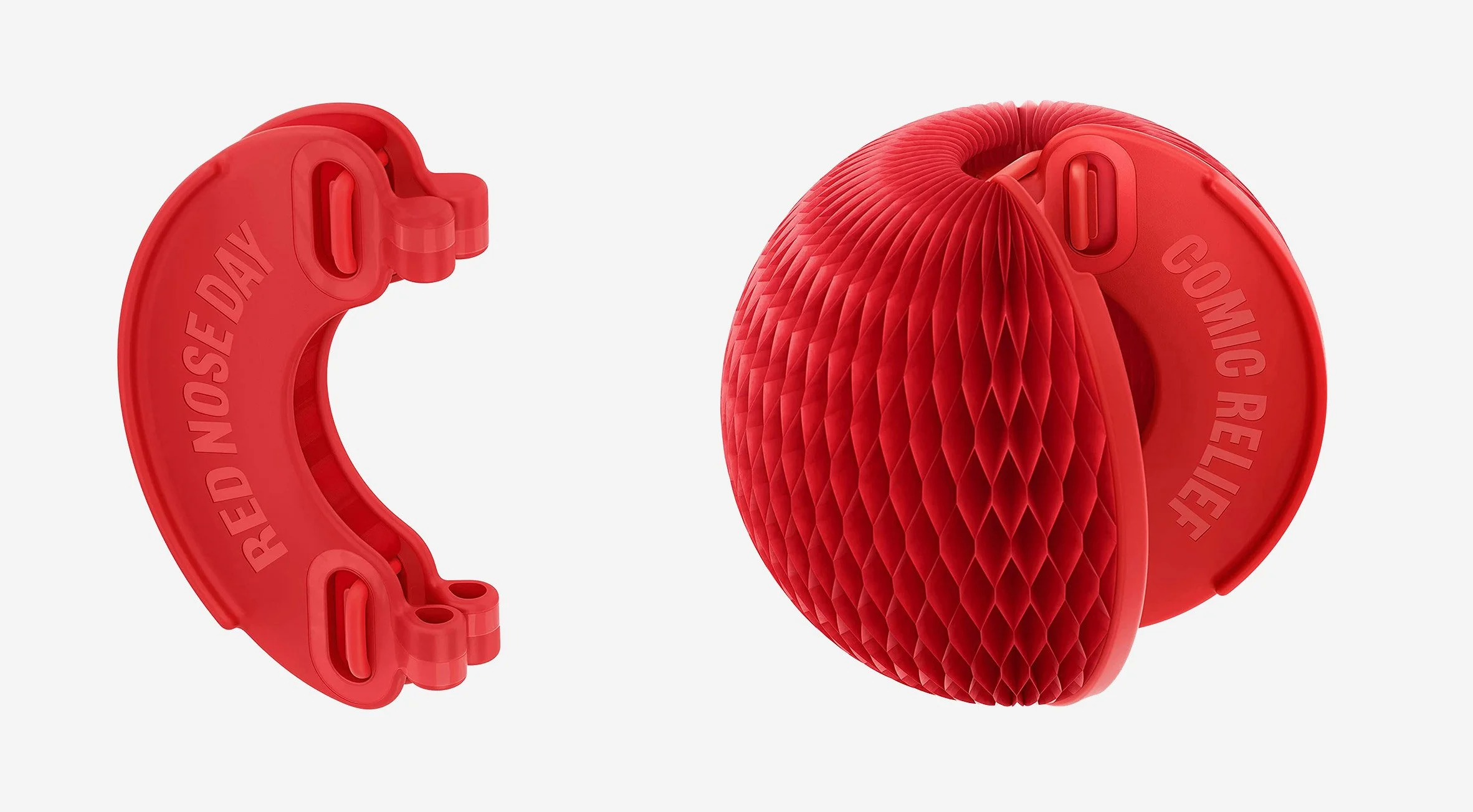
A sixty-thousand-dollar turntable. A clothing line that looks like it raided the color palette of an old iMac. A recyclable red clown nose for charity. Three official seals for King Charles, including one for space sustainability.
And then there is Airbnb.
Brian Chesky, Airbnb’s CEO, has been open about Ive’s influence. He had a hand in tweaking their logo in 2014. But by 2025, his fingerprints were all over their app.
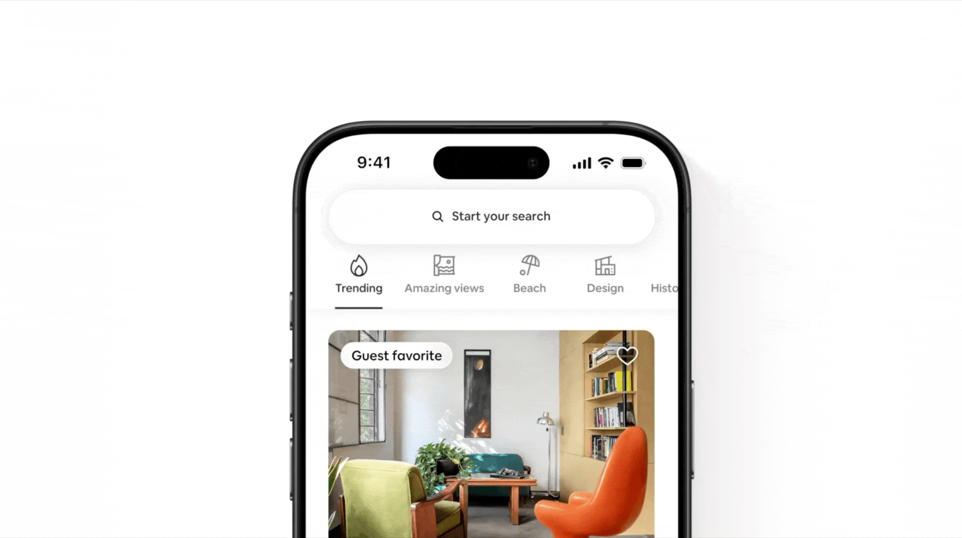
Flat icons were gone. In their place were three-dimensional caricatures, designed with light, shadow, and motion. Chesky explained that Ive saw a set of 3D visuals they had made for a landing page, loved them, and immediately started sketching entire libraries of dimensional icons. They did not use them directly, but they used them as inspiration.
Look at the new Airbnb bell icon. The metal actually reflects light the way metal does. Look at the other icons. They are not literal, not pretending to be real-world objects. They are more like caricatures. Playful exaggerations of destinations and experiences.
This is not skeuomorphism, though. It is something else.
Is This Skeuomorphism

Classic skeuomorphism was literal. Notes looked like a notepad. Contacts looked like a notebook. Books looked like a bookshelf.
This is different. Icons and UI elements today do not pretend to be those things. They are interpretations. They behave like objects. They respond to light. They cast shadows. They live in space. But they are not leather-bound or wood-paneled metaphors for something you already know.
If Airbnb wanted skeuomorphism, they would have made their app look like a log cabin. If Apple wanted skeuomorphism back, the Books app would be sitting on a solid oak shelf again. That is not what is happening.
It is design physicality. Design that is not meant to trick you into thinking it is real. Design that is meant to feel strangely familiar.
It says something that when Jony Ive took over Apple’s software design in 2012, his first instinct was to flatten everything. After Forstall’s era of leather stitching and green felt, minimalism felt like salvation.
It says just as much that today, Apple, Airbnb, and even Google are moving back toward depth. Toward light, shadow, and motion.
Ive himself has reemerged in another arena, now leading design at OpenAI. On stage recently, he admitted he feels enormous pressure to fix the unintended consequences of smartphones. He thinks the antidote might be AI. What that looks like is unclear. But designing the next generation of interfaces, ones that blend AI seamlessly into everyday life, is going to be messy.
What is clear is that software is leaping off the screen again. Not into metaphors of notepads or bookshelves. Not into Aqua’s shimmering drops of water. But into reality itself.
Maybe a decade from now, people will complain that there is too much ornamentation, too much clutter, too many shadows. They will pine for the flat era, when everything was simple and clean. Or maybe by then we will have moved somewhere stranger entirely.
Right now, in 2025, the flat era is done. And the age of physicality has arrived.